One of the things we are taught in Android is that we should gracefully handle different layouts based on screen sizes. With more and more things being not just screen size-specific but also OS version-specific, this is one thing I think a lot more devs need to pay attention to. Today was my turn to do just that.
I wanted to create a dialog with an image that resizes itself while maintaining aspect ratio but being constrained by the container. Okay.
So I went about creating my ImageView:
<ImageView
android:id="@+id/permission_image"
android:layout_width="match_parent"
android:layout_height="wrap_content"
android:minHeight="200dp"
android:adjustViewBounds="true"
android:scaleType="centerCrop"
android:src="@{ContextCompat.getDrawable(context, permission.descriptionDrawable)}"/>
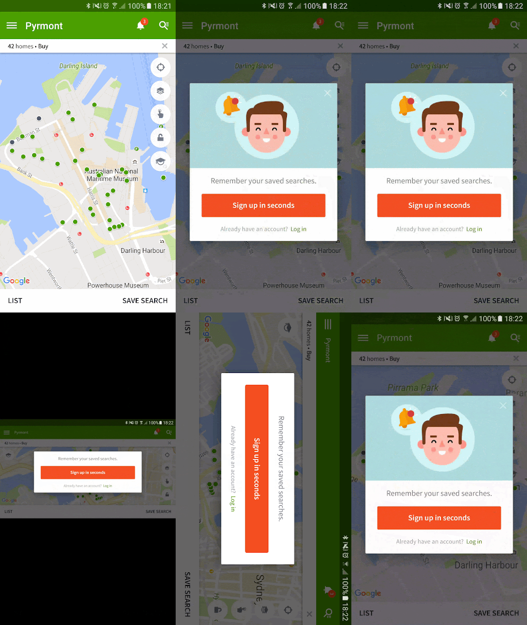
Loaded up the layout and it looks satisfactory:

But then, I tried rotating and what the hell!

The image does not fit, you cannot see “NOT NOW”. It doesn’t work. Then I tried it on a tablet:

OMG how could it possibly get worse. There is so much space and it’s not filling it up properly! I am pretty sure the root layout has layout_height="wrap_content". Weird.
After some furious Googling, I found out that I have to set the LayoutParams on the dialog after it has been shown. Why do I have to do that? I said wrap it and you refuse and now you want me to do it myself? Why?
I gave in and did the thing that StackOverflow tells me to. But it didn’t work. It still looked the same. I tried moving stuff around; calling setLayout instead of setAttributes. It still looked the same. :sad_panda:
And so the time has come to look for another approach. A couple of things need to happen: a. We shouldn’t make the user scroll just to click the buttons on a landscape phone b. Make the image take up more space on tablets
To make (a) happen, we either: create a new layout for this orientation or just set the image to be invisible. The second option is more appealing for me. There really is not much difference in the two orientations aside from the image after all. We can set the visibility of the image at runtime, but then maybe we can afford to show the image if there is enough space for it.
This means that to make (b) happen, maybe we need to tweak our layout a little. And this is where the beauty of Android’s alternative resources come in. To be as less repetitive as possible, I chose to harness styles too, since I only need to override one attribute – the visibility.
First I created a style in the default /res/values folder that I would apply to the image:
<style name="DescriptionImage">
   <item name="android:visibility">gone</item>
</style>
Now it’s time to make the variations. We want to hide the image if we are in landscape, so into /res/values-land this style goes:
<style name="DescriptionImage">
   <item name="android:visibility">gone</item>
</style>
But we want to show it if there is enough space, so into /res/values-h500dp this style goes:
<style name="DescriptionImage">
   <item name="android:visibility">visible</item>
</style>
And now it’s just a matter of applying this style to our image (and I found out that setting maxHeight works a bit better):
<ImageView
android:id="@+id/permission_image"
android:layout_width="match_parent"
android:layout_height="wrap_content"
android:maxHeight="200dp"
android:adjustViewBounds="true"
android:scaleType="centerCrop"
style="@style/DescriptionImage"
android:src="@{ContextCompat.getDrawable(context, permission.descriptionDrawable)}"/>
I applied this technique to another dialog and here’s the end result on a phone:

Yay!
